Rachel tanner photography
Rachel has spent more than 20 years photographing surf, ocean, family and lifestyle work across Puerto Rico and beyond, with credits including ESPN. Her old website didn't reflect that. It had a script logo, a crowded sidebar menu and long blocks of italic text, and her strongest images were buried in a grid of small thumbnails. The work was world-class, but the brand around it felt dated and hard to navigate.
// CLIENT
Rachel Tanner
Isabela, Puerto Rico
// SERVICES
Brand Identity
Website Design
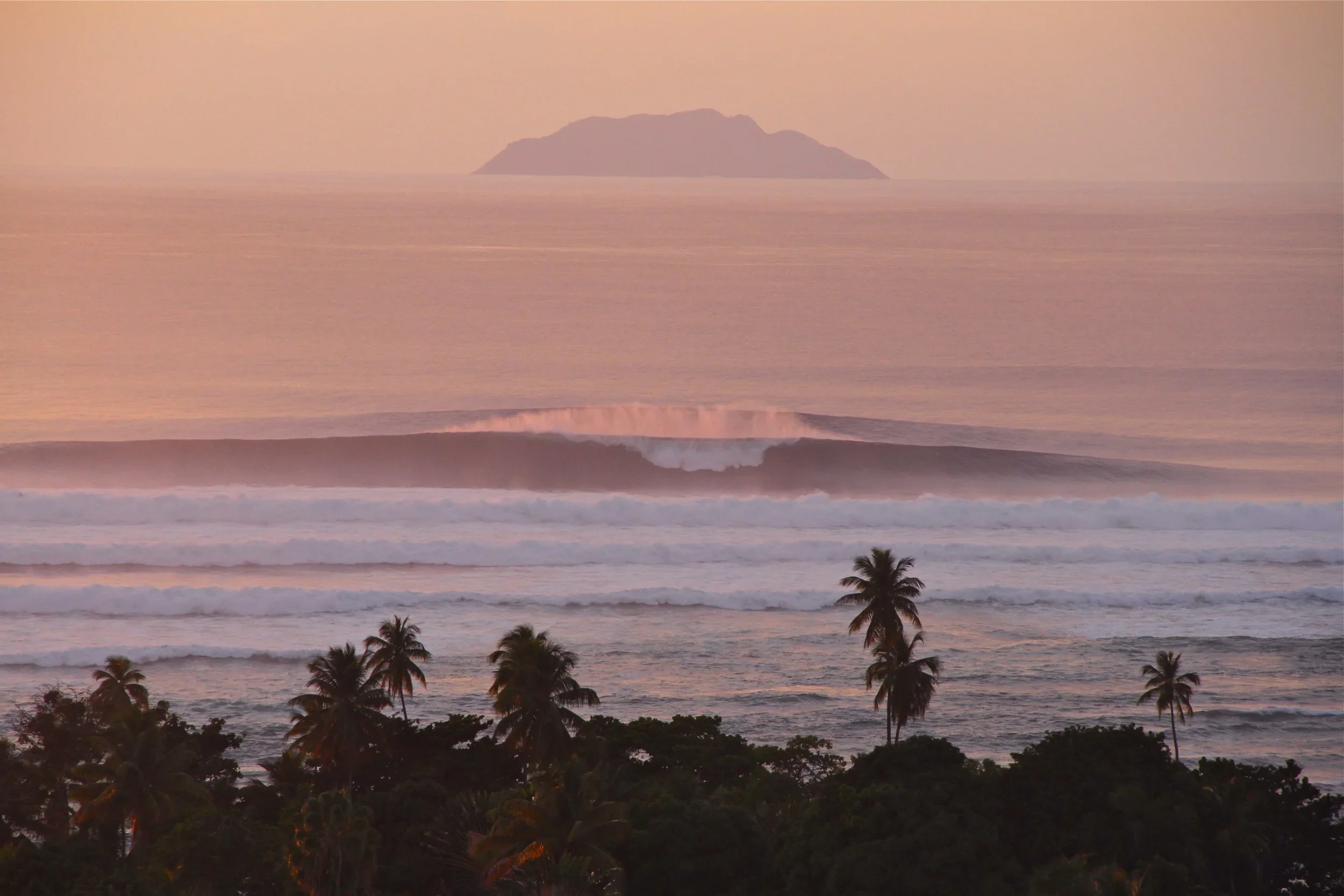

We started by rebuilding her identity from the ocean up.
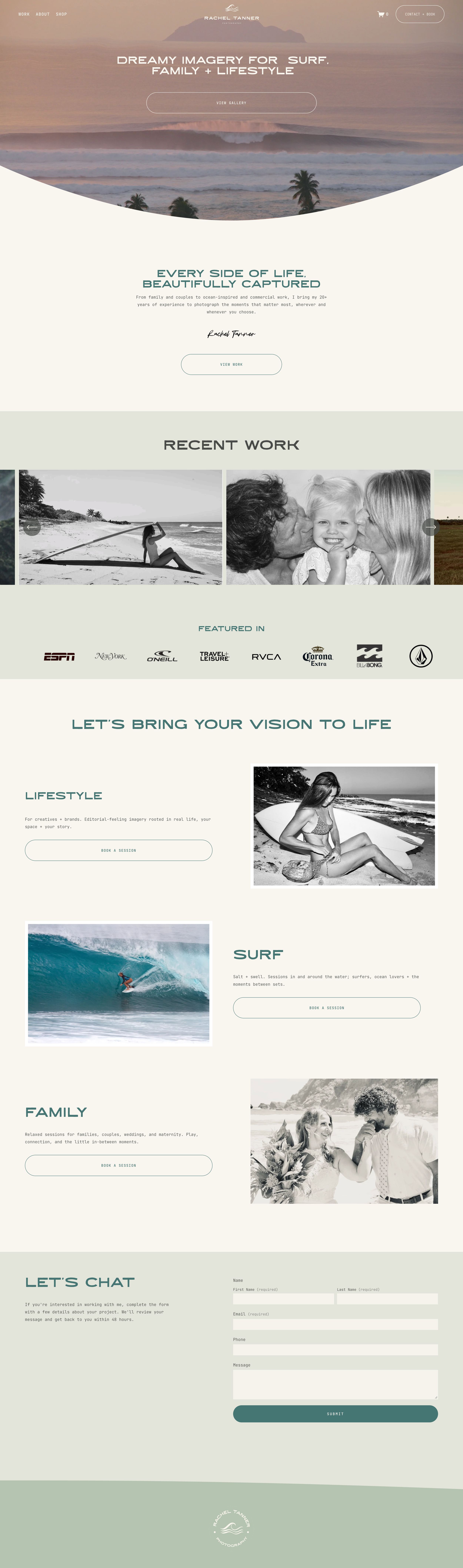
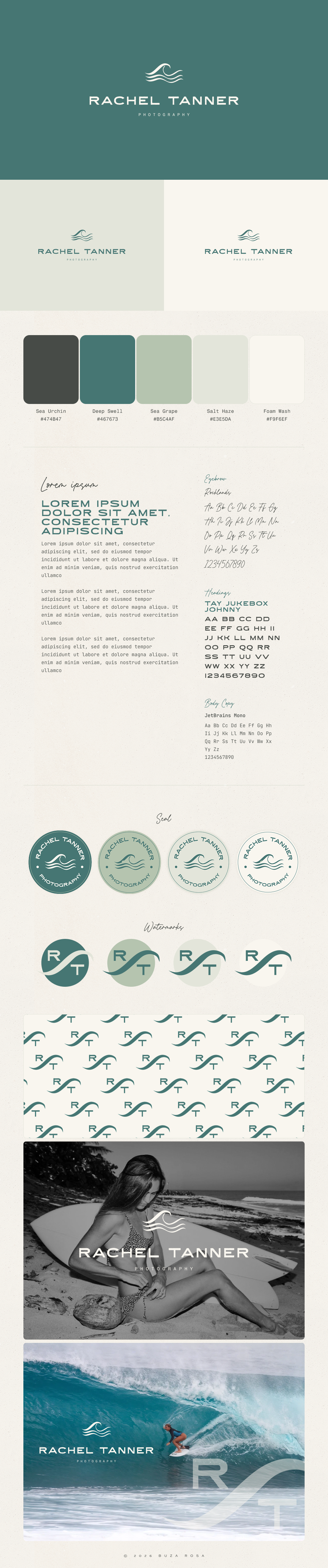
The new mark is a minimal wave icon paired with a clean, wide wordmark, plus a circular seal version for print and social. The palette comes from her own imagery: deep sea teal, sun-washed cream, soft sage and slate blue. An extended display font sits alongside a typewriter-style body font, which gives the brand an editorial, film-camera feel. Curved, wave-shaped section dividers run throughout the site and echo the logo, so the whole experience moves like water.
The website was restructured around how clients actually book.
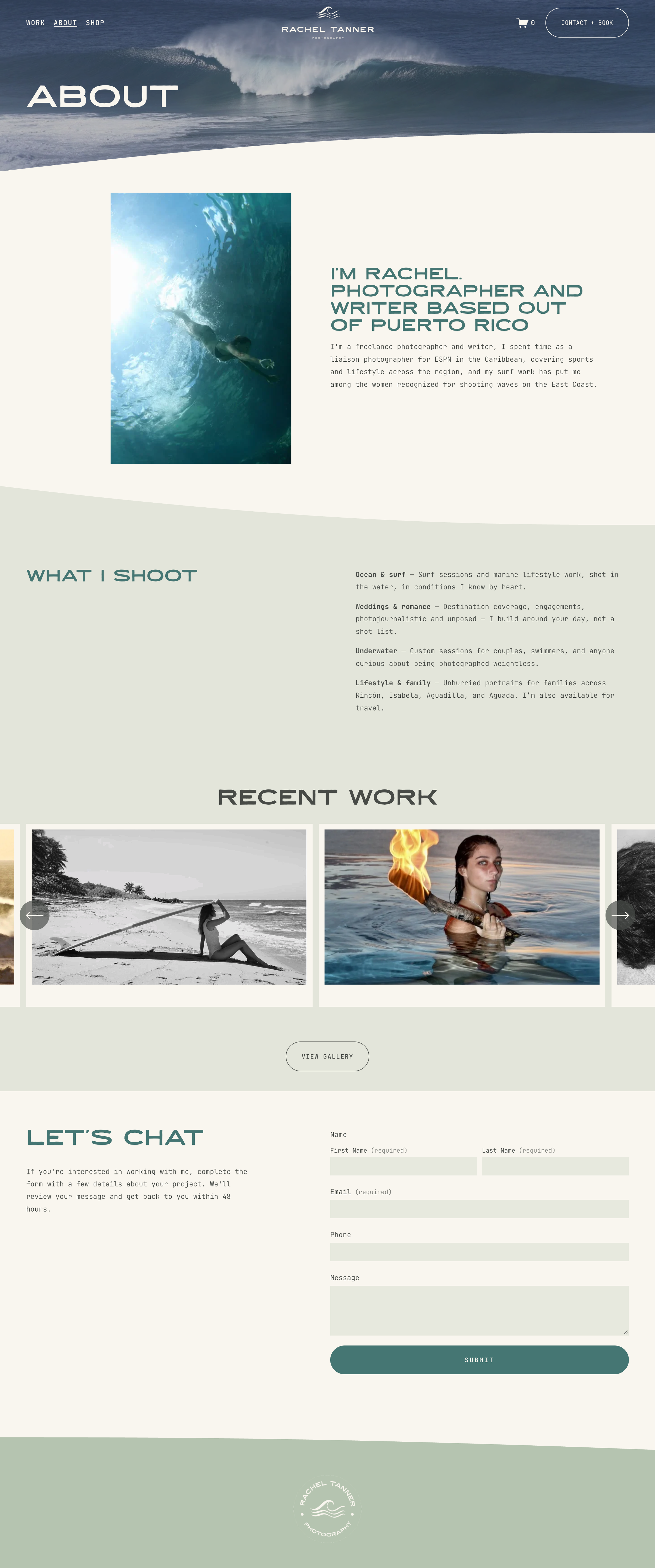
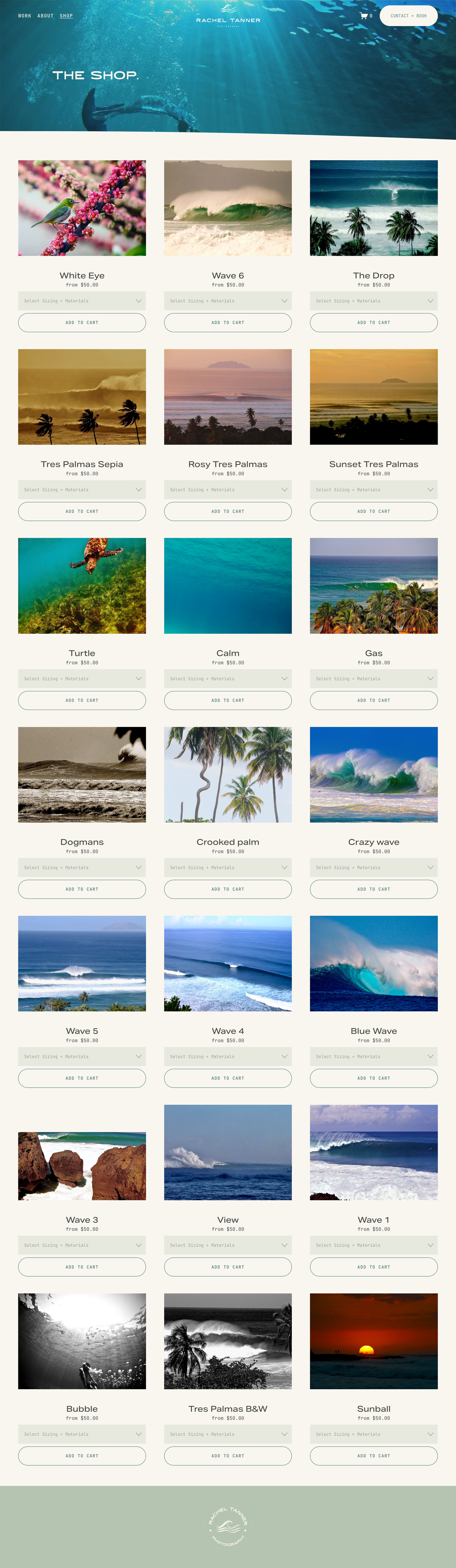
The menu went from seven items down to Work, About and Shop, with a Contact + Book button always visible. The homepage opens with a clear positioning line, "Dreamy imagery for surf, family + lifestyle," followed by a recent work carousel and a "Featured In" logo bar for credibility. Three service paths (Lifestyle, Surf and Family) each lead straight to booking. We rewrote her About page into a short bio and a "What I Shoot" breakdown, and rebuilt her print shop as a clean, gallery-style storefront with size and material options on every piece.
The result is a brand as calm, confident and coastal as her work, and a site that turns admirers into booked sessions and print sales.